
The Unspoken Perils of Misunderstood Graphics
We’ve all heard the phrase “a picture is worth a thousand words”, but sometimes, the wrong picture can leave you wishing for just a few words of clarification. Graphics are a powerful tool, able to convey complex messages at a glance, but when intent and interpretation don’t align, things can go hilariously off-track.
Lost in Translation (or Illustration)
We live in a world flooded with images. From social media feeds to street signs, news graphics to product packaging, visuals are everywhere and they grab our attention far faster than text. But what happens when a graphic sends the wrong message? When a serious warning turns into a running joke?
This past weekend, I stumbled across a perfect example.
The “No Farting” Sign
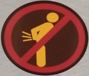
No Farting
The graphic in question featured a person hunched forward in a circle, with motion lines radiating from their rear, slashed through with a bold red line. From a distance, it looked very much like a sign banning flatulence. Let’s be honest, our brains like to connect dots quickly… and this one practically spelled out: No Farting Allowed.
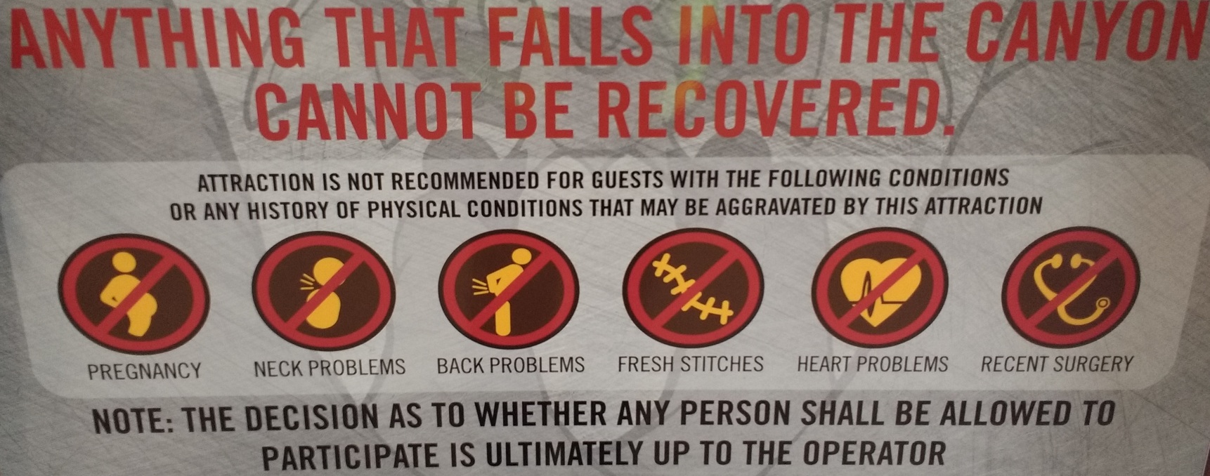
Of course, the actual intent was far less hilarious, a warning for people with back pain to avoid a jarring amusement ride, but without any context, especially in a fast-moving line of distracted people, the message was lost and a completely different idea was conveyed.
The Power (and Peril) of Context
The effectiveness of a graphic depends on more than just clean lines and bold colors. It relies on context, clarity and a keen awareness of how people will actually interpret what they see.
This comical misfire underscores a larger truth: visual communication is nuanced. What feels obvious to the designer may be baffling — or unintentionally funny — to the viewer.
Design Smarter, Not Just Prettier
To avoid mixed signals and accidental comedy, consider these best practices for graphic design:
- Know your purpose and audience: Define what you’re trying to say and to whom.
- Keep it simple, but not too simple: Aim for clarity over cleverness.
- Provide context when needed: A small caption or icon explanation can go a long way.
- Watch for cultural or visual assumptions: What makes sense to one group may confuse another.
- Test your design: Show it to someone outside your bubble. If they laugh, wince or look confused, it’s back to the drawing board.
Final Thoughts (and Warning Signs)
Graphics are essential to modern communication, but they aren’t immune to misinterpretation. Whether it’s workplace presentations, public signage or amusement park warnings, clarity should always take priority over cleverness. Because if your graphic needs another graphic to explain it… well, that’s a red flag.
So next time you’re designing a visual message, take a second look. Better yet, ask someone else to take a first look. Their honest reaction might save you from an unintentional joke, or worse, a very confusing safety message.
By taking the time to consider these questions, you can ensure that your visual communication is effective and avoids unintended consequences. Or you might accidentally ban flatulence on an amusement ride, which while not a bad idea, may not provide sufficient warning to real dangers, when one is needed.
Discover more from Tales of Many Things
Subscribe to get the latest posts sent to your email.